The year 2021 marks the 100th anniversary of the founding of Peking Union Medical College Hospital (PUMCH). The official logo of centennial anniversary was announced on the 100-day countdown.
The main form of the logo is composed of artistic lines, using red and gold as the main colours. While highlighting the festive atmosphere, it also illustrates generations of PUMCHers’ unremitting efforts and dedication to the fame and glory of PUMCH.
The red Arabic numerals "100", composed of concentric lines and sparkling like the rosy dawn, indicate that having walked through a century of glorious history, PUMCH is looking into the future with the same determination and dedication.
The most iconic PUMCH old buildings are located in the centre of the logo, implying that PUMCH, being the "palace of modern medicine" and "cradle for masters", has witnessed the development of modern medicine in China and the inheritance of PUMCH spirit and culture.
Three swallows transform into three Chinese characters “LI” meaning “force” and together constitute the Chinese character "XIE" meaning “jointly”, expressing generations of PUMCHers’ dedication to the development of China's medical science and to the protection of people’s health with their concerted efforts, just like a relay.
The acronym of Peking Union Medical College Hospital “PUMCH” combined with the time span of “1921-2021", highlights the centennial theme of the logo.
The logo was designed by a team led by Chen Nan, professor with tenure of the Academy of Arts & Design of Tsinghua University, who also presided over the design of visual recognition system for the 110th anniversary of Tsinghua University.
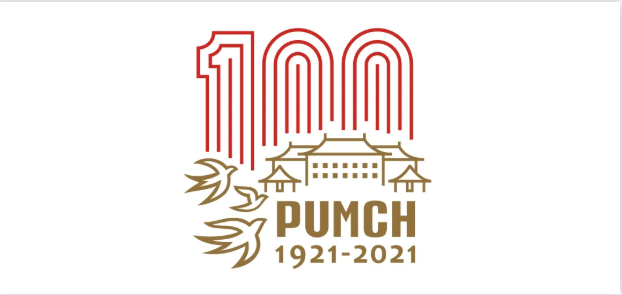
Official Logo of PUMCH Centennial Anniversary
Text: Centennial Office
Picture: Centennial Office
Translator: Lu Junliang
Editor: Che Lu